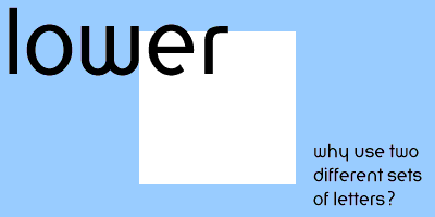
lower is based on a herbert bayer's universal alphabet - which consists of only lowercase letters cut to geometric forms.
click on any of the font styles to see a preview:
Regular | Bold | Italic | Bold Italic | Tight
the bauhaus was a school founded in 1919 by walter gropius at weimar, germany, and later located successively at dessau, berlin, and chicago, to develop a functional architecture based on a correlation between creative design and modern industry and science. the work of the bauhaus to move towards a level of clarity in design and production also directly affected their opinions on typography. germany at this time preferred heavy, complicated, gothic style fonts; known as fracturs. this style had been used traditionally in german printing, but was difficult to read.
![]()
the simplicity of san serif designs was an attractive alternative to the bauhuas. herbert bayer, a teacher at the bauhaus, proposed a new system of writing:
"why should we write and print in two alphabets? both a large sign and a small sign are not necessary to identify a single sound. we do not speak in a capital a and a small a. a single alphabet gives us practically the same result as the mixture of upper and lower case letters, and at the same time is less of a burden on all who write." --herbert bayer from bauhaus 1919-1928 p.147
to this end bayer created what he called the "universal alphabet."
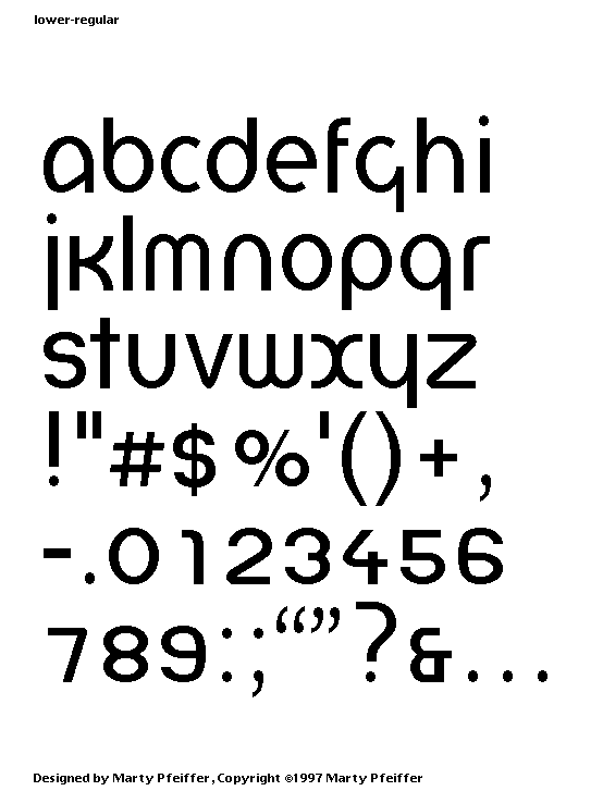
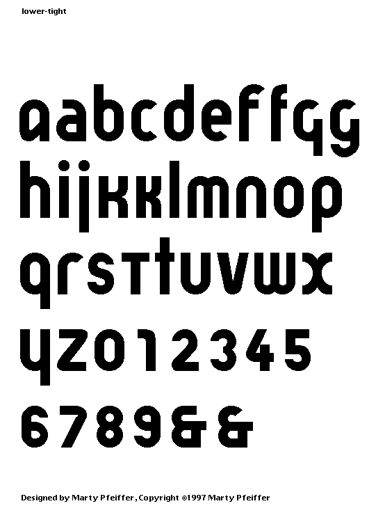
my design is an attempt to bring bayer's design into practical use. i am creating a family of fonts that can be used for everyday body copy (i.e., 9-14 pt size type). this family will include regular, bold, italic and bold italic. there is also a narrow font designed for headlines or other special effects. i am creating a multiple master version of lower as well as the general version. this multiple master version would allow you to select exactly the weight you need (from light to black).
you can check out lower before you buy! just choose the appropriate link.
![]()
demoware version 1.0 (includes a limited version of the regular)
macintosh: postscript | truetype
windows: postscript | truetype
this font is being refurbished. it is scheduled to be released by 10/18/2016. |
|
send marty a comment about his fonts. |
|
see all the fonts available from scooter graphics |